Proper Painting Proportions – What Works Best?
 Choosing paint colors can be intimidating and for good reason. Once walls are painted, it’s a look you are potentially “stuck with” for a long time to come. There is a bit of a science to getting paint colors right, too. It’s best to consider what experts have to say when it comes to many big decisions in life. This is also true of the seemingly small matter of “proper paint proportions” on interior walls.
The Effects of Paint in a Room
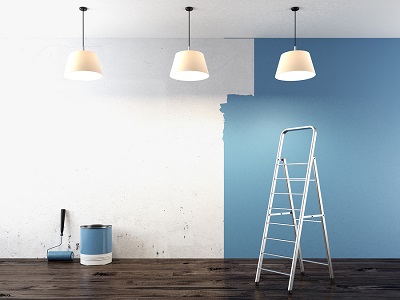
Does it really matter if you get use the right paint proportions? Yes, very much so. Paint colors contribute more to a room than many people realize. Unfortunately, it only becomes truly obvious when a paint job is all wrong. It can literally be unpleasant to be in a room that creates a feeling of dissonance. A sense of balance is achieved with correct paint proportions. Of course, a room looks more inviting, as well, when the paint colors strike a harmonious chord.
What are the Proper Color Proportions for Interior Walls?
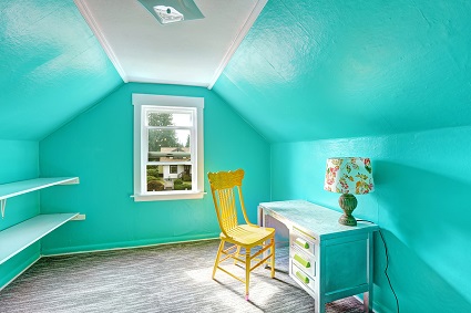
There are varying theories about ideal color proportions for interior walls, but the 60-30-10 scheme prevails. The dominant color should cover 60% of a room, a secondary color should occupy 30% of wall/ceiling space, and an accent color makes up the remaining 10% of wall space.
If the three colors you choose for a room are evenly proportioned in their application, the result is strangely off-kilter. You could compare this to a head-to-toe look in fashion. More than half is the primary or dominant color of the garment. Visual interest is created with a secondary color blended in for 30% of the look, which could be the color of a purse, necktie, or shoes. Accessories, such as pieces of jewelry, provide the 10% accent color.
Tips on Choosing Paint Shades
 Strictly going with colors that you personally like may not be the best guide for choosing colors. Research shows that there are valid reasons to proceed with caution when choosing the color of the paint for your walls. It will simply look better, for example, if you choose a blue that is more subtle than a particular blue accessory or piece of furniture in your room. An attempt at an exact match detracts from the overall look.
You may like bright colors, but colors that are too bold can be unpleasantly overpowering. People have physiological responses to colors; it’s part of the human experience. If a bedroom has bright yellows, research shows it can stir feelings of anxiousness. There are certain shades that are best in bedrooms because they invoke feelings of restfulness and calm, including lavenders, natural shades of green, and silvery blues.
You can’t go wrong if you do a little research on shades within your range of personal preference. Then use a color wheel to determine which two shades to choose that will complement the dominant shade in a 60-30-10 paint proportion scheme.
Our paint professionals at Franklin Painting can help with every aspect of your paint project. Don’t hesitate to give us a call for interior and exterior house painting questions and a professional paint job done right. Call us at (877) 646-7774.