Why You Should Consider A Monochromatic Color Scheme
Monochromatic designs are becoming a popular interior design trend. It’s a simple, yet sophisticated approach for the minimalist who wants to create an elegant and luxurious living space. The stunning appearance is simple to achieve when you understand the basic concept. However, transitioning from a polychromatic design to a monochromatic color scheme can be intimidating when you don’t know where to start.
 Start with a Solid Foundation
An easy place to start is to use select one of the colors in your flooring as the base hue for your monochromatic design. Whether you have a wooden floor, tiles, or carpeting, the base color determines the other shades that will work with your monochromatic color scheme. It’s a solid foundation that helps define your overall design. From the base color, you can start layering your way up with complementary shades.
You can also choose the base color by looking at the colors in your furnishings or walls, or perhaps you already have a preferred monochromatic color in mind. Once you have chosen a base color, the next step is to choose two shades within the same hue: a tone that is lighter than your base color and a darker shade. Using different shades of the same color or hue is the key to perfecting the monochromatic design. It ties everything together without looking monotonous. So, let’s say you want to use white as your base color, which is trendy. You might select Benjamin Moore’s White Opulence as your base or primary color, with Chantilly Lace and Maritime White as the two complementary shades for contrast.
Contrasting Texture
You don’t want too much of the same color in the room. Therefore, the texture is an essential element when painting a room in a monochromatic design. If the design and features are too similar, like white furnishings with white walls and white ceilings, the living space may seem dull or too flat. You can use textures to liven the space that also adds a subtle contrast to your room. Consider arranging furnishings, or even a beautiful throw rug on a wood floor, with different textures and patterns that complement your monochromatic color. When in doubt, neutral colors always work.
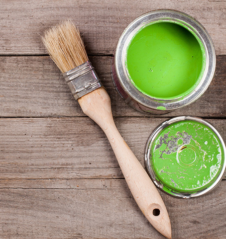 Bold Colors Work Too
White is a popular monochromatic color. However, you don’t have to limit your options to merely white or neutrals. Other bold colors, such as green, yellow, and violet, can be appealing for your space. Other aspects such as shape, the reflection of light, and size of the area will also have a significant role in personalizing a room.
Be Creative When Layering Colors
In a monochromatic design, you maintain the same hue and undertone throughout. However, you are not limited to one flat color. You can be creative with contrasting shades as you design your space. Perhaps white for the kitchen, beige for the family room, yellow or blue for a bedroom, dark grey for a bathroom, etc. If you are designing your space for the first time, you are probably unsure which complementary colors to select. You can try selecting a color that is already in your room furnishings, floor, or walls. Then, choose shades with a common hue. Painting contrasting shades of the same hue ensures the monochromatic color will blend effortlessly to give you a beautifully designed space with a clean, cohesive appearance.