Feeling Blue? Here’s Some Paint Colors to Lift Your Spirits This Winter
 Maybe it’s the shorter days, or the rain and snow storms, or the fact that we tend to slow way down during winter. Whatever the cause, many people feel less than their “perfect selves” during the long winter months. If this sounds like you, there’s one easy idea that might help.
Color.
Psychologists have known for years that colors have an amazingly strong impact on our mood. We’ve been conditioned over many generations to respond predictably to color – red means warning, yellow means caution, green means go, etc. But there’s more to it than that.
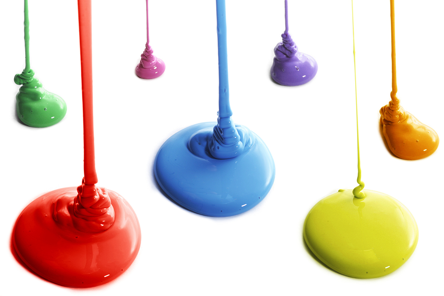
The colors in our homes can influence how we feel. In most cases, this isn’t a powerful mood-setter, but it definitely can have an effect. If you’re handy with a paint brush and roller and think some new color could help you ward off the winter blues, here are some ideas.
Green: In addition to signifying “go,” green is a color of nature, something sorely missing in our winter landscape. Most shades of green are calming and tranquil – and pretty easy to mix with other color schemes.
Slate: This deep, healthy color brings in both blue and gray overtones and is considered a stable shade that can help ground and restore you.
Deep brown: The deeper you go with brown, the more luxurious and settling it gets. Very few of the brown shades are considered “alarming,” making them good mood-enhancers.
Neutral yellows: The yellow family, particularly the pastels, bring a hint of sunshine and happiness. Soft yellow is a great shade for large areas within a home, with the more vibrant yellows reserved for select trim sections.
Blue: Blue is another color that brings about feelings of tranquility and serenity. As with yellows, the pastel blues speak of clear days and happier times. Go easy with too much heavy blue, however, as it can have a reverse effect – that’s why they call it the “blues.”
A general rule of thumb in adding color to positively affect mood is to stick with softer varieties for walls and ceilings, moving into deeper shades only from trim, molding and other accent areas.
Colors to avoid
 If you’re painting for mood, you’ll want to avoid the bright, full-on versions of colors like red, orange, purple and pink – yes, you can “Love Pink” in your wardrobe, but a vicious pink glare on your walls can have an unsettling effect.
Fully developed, intense colors are great attention-getters – that’s why you don’t see very many products packaged in soft lime or sky blue. But moods are best enhanced when colors blend in with a lifestyle rather than constantly scream for attention.
New paint may not be the answer to every winter-blues problem known to the human race, but it might be a pleasant way to ease you through the cold months and bring you into the loveliness of spring.
Would you like help in producing a calming, relaxing interior color scheme for your home? Franklin Painting of Connecticut can transform your living area with a professional touch on small and large jobs. Call us at (877) 646-7774 and tell us your ideas.