What is a Circadian Palette?
We often think about color palettes in terms of style and aesthetic, but color can also shape mood, energy, and even sleep. Interior paint plays a major role in how a space feels from morning to night, influencing comfort, focus, and relaxation in the rooms you use most. A circadian palette considers how paint interacts with natural and artificial light throughout the day, working with your body’s internal rhythm rather than against it. Thoughtful color selection can make a home feel balanced, calm, and energizing at the right times.
 What Is Your Circadian Rhythm?
Did you know your body runs on a 24-hour internal clock? This rhythm regulates sleep, alertness, and even hormone production. Light exposure plays one of the strongest roles in influencing it. For example, bright light helps promote focus, while warm, softer light signals the body to rest and relax.
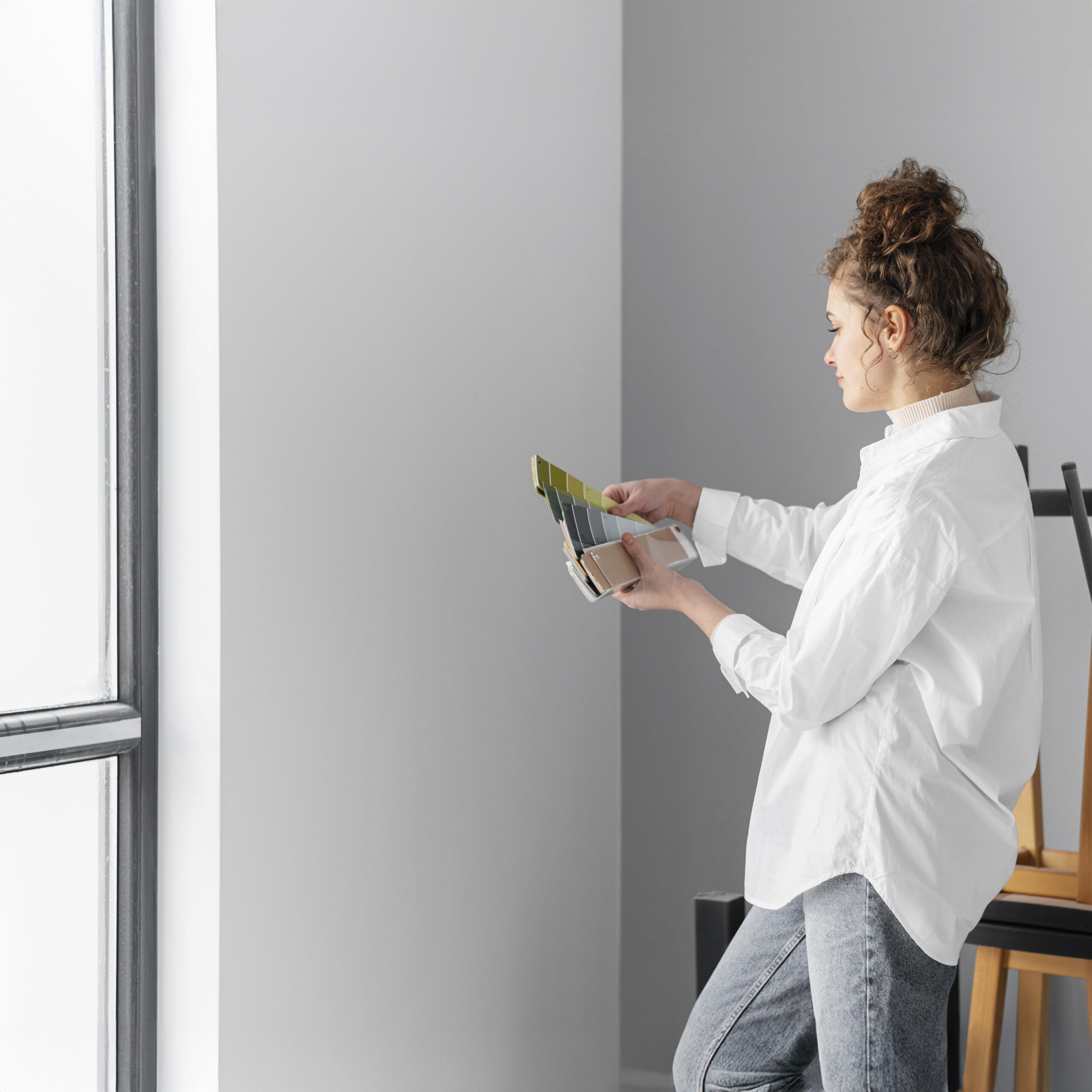
Paint color interacts with light, determining how a space feels throughout the day. This is one reason paint professionals often recommend bringing swatches home to see how they look in your natural and artificial lighting.
What Is a Circadian Palette?
A circadian palette is a collection of paint colors chosen to support how a space is used throughout the day. It is a set of tones that works in harmony with sunlight, artificial lighting, and room function.
This plan encourages homeowners to think beyond trends. Instead of selecting colors solely based on popularity, choose shades intentionally to boost energy or aid relaxation, depending on the space.
Paint Colors That Support Energy and Focus
Some colors work especially well in productive spaces such as home offices, kitchens, and morning areas. The base colors for these rooms often include soft cool whites or light grays. Complementary shades could include muted sage greens or pale sky blues.
Why do these work? These tones reflect natural daylight beautifully and feel crisp in daybreak light. They pair well with brighter, cooler white lighting commonly used during work hours. Together, they promote focus and alertness without feeling harsh. Refrain from overly stark whites paired with cool lighting, as this combination can feel sterile or clinical.
Paint Colors That Encourage Rest and Relaxation
On the other hand, certain colors naturally feel calmer and more grounding, making them fitting for bedrooms, living rooms, and evening gathering spaces. The base colors for these rooms often include warm neutrals such as ivory tones or soft taupes. Complementary shades could include dusty blues, muted mauves, or earthy clay tones.
And how do these work? These shades soften as the day dwindles and pair beautifully with warm evening lighting. They create a cozy ambience that feels inviting rather than stimulating. These tones reduce visual intensity and help signal to the body that it is time to relax. Steer clear of overly bright or highly saturated colors in these spaces, as they can feel energizing when rest is the goal.
 Design With Wellness in Mind
When choosing paint, consider how color and light interact throughout the day. A thoughtful circadian palette can help make spaces feel intentional. Explore Franklin Painting’s color collections to find shades that support both your style and your daily rhythm for your home’s interior and exterior surfaces.