Interior Paint Colors for a Calming Effect
We spend a lot of time talking about lovely paint color combinations for our living spaces that bring out our true personalities and reflect our unique tastes. But when people in the home have special needs regarding colors, it’s important to understand the potential effects of certain colors and shades. Franklin Painting offers interior painting services that can help you choose colors that both look beautiful and support your family’s comfort.
Franklin Painting of Farmington, CT, would like to share a few ideas about creating color schemes that may be comforting for people with color sensitivities.
Individuals with autism, ADHD, dyslexia, and other neuro-related challenges sometimes respond in dramatic ways to the dominant colors around them.
The response can go toward either end of the positive/negative scale.
Here’s a general overview of how dominant room colors are believed to affect people’s moods.
 Color basics
Studies indicate that brighter, darker, and more vibrant colors tend to crank up the emotions and energy, while lighter shades often produce a calming, centering effect.
Bright colors would be the most extreme versions of orange, pink, red, violet, blue, yellow, and other glaring shades.
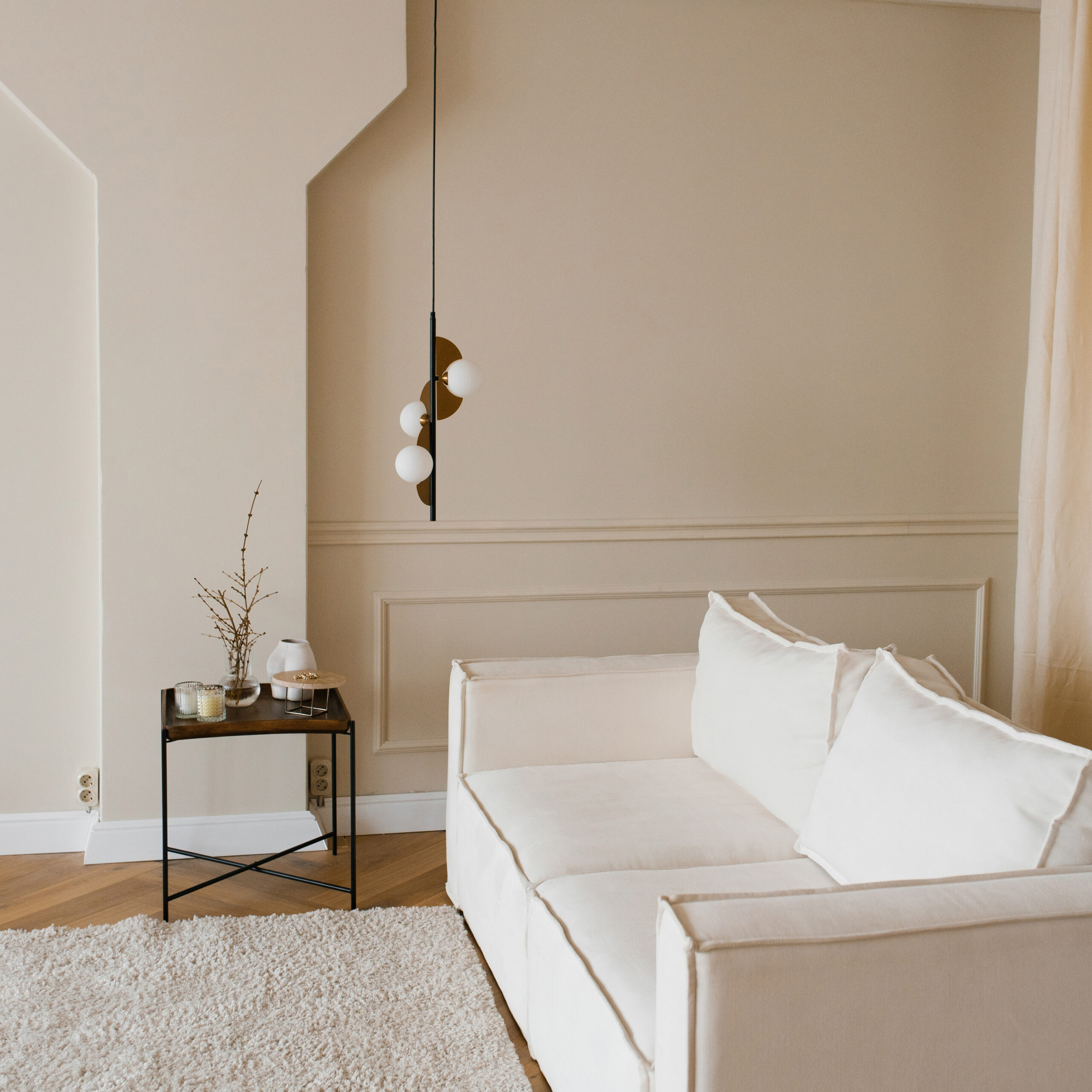
Lighter colors include “true neutrals,” which are black, brown, gray, and white. They’re called “true” because they contain no other colors in their makeup. Also in the “lighter” category are faded versions of all the colors we see every day – purple, green, blue, red, and so on.
The accepted rule for using paint color to create a calming effect is to use light, neutral shades as the dominant colors. You can experiment with more vibrant colors on the trim, molding, and other highlights to add some contrast.
If you’re preparing a room or a space for a person with profound color sensitivity, you should talk with the individual’s doctor or therapist before throwing on the paint.
Incorporating all this into the colors of your rooms
When you look at a room or living area, consider all the colors, not just the paint. For general interior decorating and for creating neuro-neutral spaces, every color and shade can contribute to the overall effect.
Historically, we’ve used more gentle colors for large wall areas and ceilings. Using any of the alterations of white, gray, tan, or yellow as the dominant color can make a space feel larger than it is. Dark, heavy, vibrant colors can make people in the room feel like the space is smaller – or even getting smaller by the minute.
When painting and decorating for neurosensitive individuals, “calming” should be the effect you’re aiming for. Your own sensibilities can guide you to what kinds of color schemes will achieve this effect.
 Help with your next painting project
Franklin Painting provides expert interior and exterior painting services throughout the greater Farmington, CT, region. We can give you our suggestions for getting the most out of your color schemes, and we can paint according to directives you give us when creating custom neuro-neutral spaces.
Reach a painting professional by phone or get in touch by using our simple contact form.