How to Choose Colors for Interior Painting
by Frank Campanelli – frank.campanelli@gmail.com
The old days of using one color throughout the house with another shade for the trim has long passed. Today’s decorators and homeowners embrace the rainbow of colors available to make the home’s interior beautiful and create a special environment for your individual tastes and lifestyle. But with so many colors, shades, hues, tints and tones to choose from many people are overwhelmed and confused about how to choose the right mix for their interiors. For over 25 years have helped thousands of clients make the right choices, but it really helps to understand color and how it works to make better choices. That’s why we put this blog post together – to help consumers get better informed about color choices and how colors work together to create amazing interiors.
Browse the World of Color Choices by Benjamin Moore (Shown Below).
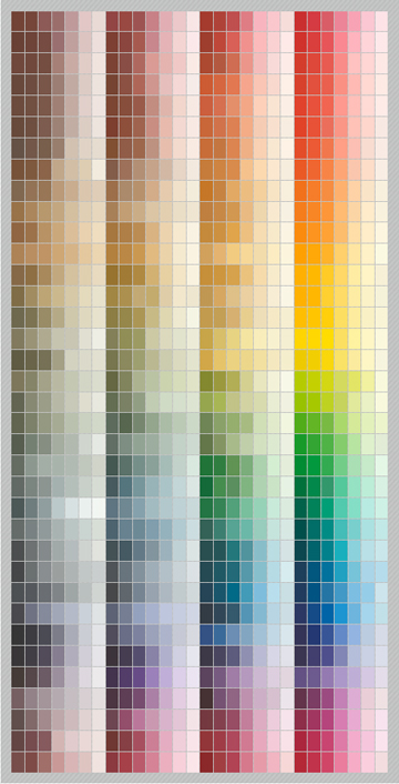
This Tool from Benjamin Moore is Great For Visualizing Color Choices. Try it by Clicking on the Link Above.
Many times we get asked, “what are the color trends now?” which is a dangerous question to answer because as we all know – trends change. Look around your home first before forming thoughts about possible color combinations. Rather than following a trend it is more important to look at your own personal preferences, the existing decorating and furnishings, the lighting (natural and artificial) and any fixed colors in your home like brick work, stone work or exposed beams when making color choices for walls, ceilings and trim. Don’t be afraid of change either, with our guidance you won’t make a choice that will look bad. Ending up with a beautiful interior that reflects you, your family and your needs is much better for you than the latest trend. We do stay on top of what colors and types of colors are currently more popular than others and will be happy to share that information for your consideration too. Exterior colors are much more of a constant than interiors. Interior living spaces call for that personal touch and people change interior colors more often than the exteriors of their homes.
We found some informative videos to share with you that will make this information easier to learn, so don’t miss the videos included below.
Let’s start with some terms that are used when describing color. The Hue is the pure basis of a color from which lighter or darker variations can be created that are of the same hue. Monochromatic paint schemes utilize variations of one Hue.
This chart illustrates well using color how these terms describe color.
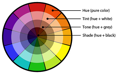 Tints, Tones and Shades tend to be used interchangeably but in reality they refer to very different things. The Tint of a Hue (pure color) is achieved by mixing the color with white. The Tone of a color results from mixing the pure color with grey. The intensity of a color can be toned down by adding grey. The Shade of a pure color combines the color with various small amounts of black. The Value of a color relates to the lightness or darkness of the same Hue. Light blue and dark blue may have the same Hue but different Values.
The Color Wheel – Learn How To Use It

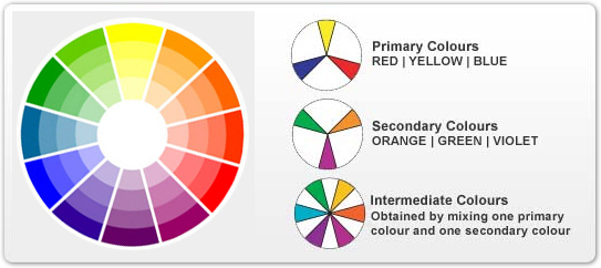
Paint themes are derived from different choices from the Color Wheel. The basic themes include Monochromatic, Complementary, Analogous, Triadic and Tetradic Themes. The colors in the wheel are divided into Primary Colors (Red, Yellow, Blue), Secondary Colors (Orange, Green, Violet) and Intermediate Colors (achieved by mixing one Primary and one Secondary). Intermediate Colors are also called Tertiary Colors.
These Paint Theme terms are used when discussing how paint colors relate on the Color Wheel. A good understanding of the color wheel is needed to choose color combinations that will work well together. The Color Wheel is based on 12 colors, although more colors may be shown if tints, tones, shades are included.
 The Monochromatic Theme uses variations on one pure color. A Monochromatic color scheme will only use one basic color or hue. So that would be light blue walls with darker blue trim both based on the same base color. Typical color strips from paint companies show a range of Values on one strip that are based on one Hue.
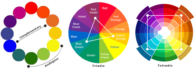
On a Color Wheel you will find Complementary Colors are directly opposite each other. For instance Red and Green are Complementary Colors. The Complementary Theme can be used effectively when one color is used as a dominant color and the other used in a subtle color based on the Complementary Color Hue. This theme creates the most striking design impressions. These themes are used for intense or modern looks.
An Analogous Theme, also called an Adjacent Theme uses colors that are next to each other on the Color Wheel. So for instance Yellow, Yellow-Green and Green or Red, Red-Violet and Violet. These combinations are common in nature and therefore pleasing to our eyes. They can create a brightness in interior spaces, but remember to choose one Hue as the main color and the others to be used to accent that color.
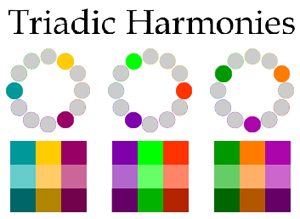
The Triadic Theme uses three colors on the Color Wheel that are equidistant on the wheel. So they will form a triangle by their location on the wheel. A subtle color and a dominant color must be identified to avoid two dominant colors clashing. If the Intermediate Colors of Yellow-Orange, Blue-Green and Red-Violet were used that would be considered a Triadic Paint Theme.
Four colors that form a square by their position on the Color Wheel are also considered Harmonious and may be a part of a color theme too. The Tetradic Scheme (double complementary) is the richest of all the schemes because it uses four colors arranged into two complementary color pairs. This scheme is hard to harmonize; if all four colors are used in equal amounts, the scheme may look unbalanced, so you should choose a color to be dominant or subdue some of the colors.
When deciding where and to use the colors you choose in a room something called the 60-30-10 rule is great for determining the amount of each color in a room. Devote 60% of everything to your main color, and the rest divided accordingly. This flows right through decorating pieces, furnishing and accessories as well. Your 10% may not even be in the paint, it may be in the pillows, lamps and artwork.
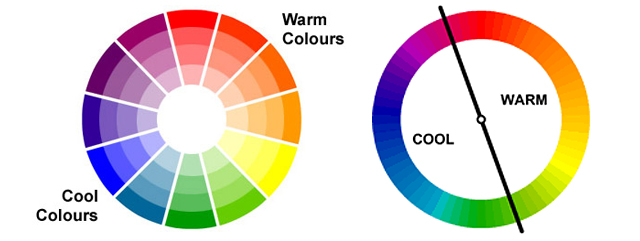
We often hear colors referred to as Warm Colors or Cool Colors. This illustration below indicates that Warm Colors are Red, Orange and Yellow while Cool Colors are Blue, Green and Violet. Both warm and cool colors can be used effectively in the same room.
So, that is a lot to consider isn’t it! Color actually has a language of it’s own, but when making these important decisions as you work with your interior painter or designer it is helpful to acquaint yourself with the basics.
Now even more to consider, the meaning of colors. Remember what color means to you is more important than these basic ideas about color. Color choices should reflect personal preferences over universal opinions. For instance what do you choose in your clothing colors, what magazine covers appeal to you, how about your cars or accessories – take a look around at your surroundings and note what has appeal to you. That will provide a good starting place for planning your interior paint choices.
Remember that colors can lean different directions from where they start on the Color Wheel, picking up traits of the neighboring color. You may start with green, but when you lean towards yellow you can transform the calm green into a more lively pear color. Red can mix in a bit of purple or violet and add passion and sensuality. Blue can add a bit of green ending up with a teal that provides a great place to start and add touches of purple for a jazzy look or blue and green for a harmonious look.
Think of the room you are considering and the mood you are after. Tranquil, romantic, exciting, hungry, uplifting, etc – then think about what colors will create that feeling for you.
Here’s some fun interpretations that we have gathered up for your perusal.
– Red – A stimulating color, never to be over-used but used right it can really deliver. Impulsive personalities gravitate towards red.
– Yellow – Increased mental stimulation and to add brightness in rooms with limited or no windows. Extroverted, high energy individuals may lean toward yellow and red accents. Yellow is high-energy and cheerfully uplifting.
– Orange – Said to influence appetite, a popular choice for dining rooms and appealing to the non-conformists and opinionated among us.
– Green – Has a calming effect on nerves, even said to lower blood pressure. Green is a favorite for many intense individuals and can create really dramatic effects when combined with other colors. Green is the color of nature creating a friendly and comforting atmosphere where it is used.
– Blue – Another calming color, decreasing effect on appetite and appealing to those that are cool, calm and collective. In nature we think of the blue sky and sea and the calmness and tranquility present there.
– Violet – A royal color that also has a calming effect along with its purple and lavender brothers and sisters.
– White – Has been the color of purity and cleanliness so if that’s you lean toward the thousands of variations of white available, perhaps combined with something a bit more daring for your accents.
– Black – Can create a sophisticated, elegant or bold element when used correctly in your color palette. Never use too much black or it will loose its effect and overpower everything.
Understanding the Color Wheel in Interior Design
The interior paint color wheel is an indispensable tool for selecting colors for home interior. It visually represents the relationships between colors, helping you confidently choose complementary, analogous, or contrasting shades. Whether considering a double complementary room design or a triad complementary color scheme, the color wheel simplifies these concepts, making it easier to conceptualize your space. The color wheel provides clarity for those puzzled by how to choose paint colors for your home interior. By aligning your choices with the color chart for wall paint, you can ensure a harmonious blend throughout your home.
Practical Tips for Choosing Interior Paint Colors
When it comes to how to choose interior paint colors for your house, start with the colour chart for house painting. This resource offers a broad spectrum of shades, enabling you to visualize how different hues could transform your space. If you’re seeking help choosing paint colors, remember the importance of lighting—both natural and artificial—as it significantly affects how colors appear within your home.
To effectively use a color wheel for painting, identify a primary color that resonates with you and then explore its complementary and analogous colors for a balanced palette. Picking interior paint colors becomes less daunting when you remember the 60-30-10 rule, as it provides a structured approach to incorporating your chosen colors. Whether you’re drawn to the serenity of cool colors like violet—which, to answer the question, is considered a cool color due to its proximity to blue on the color wheel—or the warmth of reds and yellows, selecting a cohesive palette will enhance the overall aesthetic of your home.
Finally, take into account the power of how to choose complementary paint colors. This strategy can create dynamic interiors that are visually appealing and emotionally comforting. Remember, the ultimate goal in how to choose interior paint colors for your house is to create a space that reflects your personality and style, making your home truly your own.
One “tried and true” method for interior paint choices is to paint the walls a neutral color like a beige and the ceiling and trim white. This is a choice many sellers opt for when wanting to help the marketing their home with a fresh, clean coat of paint.
Great Video on How To Use Color Theory When Decorating put together by Howcast.
Here’s Some Other Quick Tips to Remember.
Don’t Rush into a Decision – It is ok to collect paint chips, magazine clippings, wallpaper, fabric, carpet or upholstery swatches and take time making your decision on interior painting.
Examine the Colors Closely – Once you narrow things down, be sure to look at the shades nearby the choices you’ve made to make sure you treat your dominant, neutral and accent choices properly. Tape the color strip vertically in the area that you are considering using it, then observe it at different times of day and under varied lighting situations.
Paint Finish Choices – Now that is a whole separate blog post but as a quick review, matte or flat finishes hide wall imperfections, glossier finishes reflect more light.
White is Often in the Mix – Many combinations make use of a white or off-white of some type, so make sure the white your choose matches your other colors. You can go for a cooler, blueish white or a warmer yellow or pinkish direction.
Keep Good Records – There is nothing worse that saying “I wish I could remember the name of that paint color”. Start a notebook and keep track of all potential decorating influences that may help you make the perfect decision.
Let the Light Shine – Light is the single greatest game changer when it comes to how paint will look on the wall. Be sure to observe the actual sample in the light of your rooms under all lighting conditions that you expect to experience in that room. Rainy days, sunny days, overcast days, nights with artificial lights and dim lighting.
Go Light on the Ceilings – Generally ceilings are not directly lit so they need a lighter paint to reflect the available light. If you are after matching the ceiling color to the walls, try going several shades lighter on the ceiling.
Dry Any Samples of Paint – As we all know, paint dries a different color than it looks like when it is wet. So if you plan on painting a sample area or board be sure to let it dry thoroughly before you make any judgements.
Add Emphasis with Color – Long, narrow rooms look wider by using a light color on the longer walls opposed by the darker color on the shorter walls. Ceilings can look higher by using a lighter color or by using a darker color can look lower. Use color to direct attention to one wall of a room or away from another area. Decorators and painting professionals can give you expert advice about minimizing some things while emphasizing others with the use of color. Focal points can be created to highlight architectural features, crown moldings or arched window frames by the colors you choose.
Go For It! – Don’t lose your courage, make your statement with color. We all love color and enjoy seeing it used in everything that we interact with. Your home should not be an exception, it should be your showcase of personal color choices. When you enter a room the color is one of the first things you notice and subconsciously it can affect your mood and how you feel when you are in the room. It can change how you feel about the furnishings and decor too. Nothing can add so much for so little to your life experience, so what are you waiting for – start planning!
Kudos to It Can Be Arranged Interior Design of Atlanta, they created this cool video.
http://youtu.be/e7htbeQma0k;rel=0
The options are endless, let’s meet soon and discuss the possibilities. Franklin Painting serves all of Central Connecticut and many CT Shoreline homes as well. Call us at Toll-Free at 877-646-7774


